Customising a Record View using Canvas
Customizing Record Detail Page Using Canvas
The
canvas list view provides ways to customize the record display in the
module list. You can add record images, use custom buttons to represent
fields, use specific font style or size for the field labels, change the
alignment of field types and more. These customizations were limited
only to the list view.
The
Canvas Detail page allows you customize the record detail page to your
preference by letting you add background color to each field, arrange
them in a different order, use custom buttons instead of field names,
use different font styles and a lot more. This view is available in all
the modules, including the custom modules.
Components in the Canvas Detail Page
Similar
to the module list view, you can customize the record detail page using
Canvas. The detail page has the following components:
- Elements: It consists of the various components that are present inside a layout: Section, Tab, Table, Text, Image, Icon, and Line.
- Data:
It consists the list of components that will be displayed inside a
layout: Fields, Related Lists, Links, and Actions (Buttons like Edit,
Submit, Next etc.).
- Style:
Style lets you change the font, font size, background color, border,
shadow, radius, padding, margin, and insert background image. These
changes can be applied by selecting a desired element in the Canvas. The
options vary based on the selected element. The style applied on the
elements can be saved to the presets and reused in the future.
- Reusable Components : Components like elements, style, and data can be saved from the previous templates as reusable components. These components, once saved, you can reuse them across different modules and the fields will be mapped by CRM, automatically.
Customizing the record detail page
You
can select any pre-designed template from the gallery and customize
them according to your requirements, or create your own design template
from scratch with the help of design tools.
To customize the record detail page
- Go to Setup > Customization > Canvas .
- Click +Create Record Detail page .
- In Create a Custom Record page, select the Module and Layout from the drop-down list.
- Click Create .
- Inside the Canvas , click Elements from the left panel.
- Drag and drop Sections , Tabs , Table , Texts, Images, Icons, and Lines into the blank space.
- Add Styles as required.
- From the top menu bar, you can do the following:
- Undo or redo changes.
- Preview the canvas before saving.
- View the canvas in full screen.
- Give name to the canvas.
Understanding the Components
Elements
Under elements you can find the below components:
- Section: A section is an empty space or block that will appear in the detail page.
- You
can either insert fields from the layout to a section or insert images
of places, locations or use it as a banner to display some message etc.
- Drag the borders to resize the section box.
- Click the
icon to clone the section.
- You
can right click on the section and click insert to add fields, make the
component fixed or fluid, copy the style, paste style or delete.
- Add the style elements. (Read more about styles).
- Tabs:
Tabs allow you to organize fields and related lists into different
screens. This is a best way to provide easy navigation and a well
organized display to the users. For example, in the image below, the tab
named Related Info in placed in the products module which has three
tabs: Notes, Attachments, and Cases all within a section. By clicking on
the + icon you can add more fields or related lists as tabs.
- In the left panel you can enter the tab name and click the + icon to add more tabs.
- Hover on the tabs and click the close icon to delete a tab.
- Hover on a tab, when you get the double sided arrow icon, drag and drop the tab to change position.
- Right
click inside the tab to change one related list to another, fix or
fluid component, copy or paste related list style, lock, delete, etc.
- You can insert style elements like image, back ground color and more. (Read more about styles).
- Table:
Table can be used to display the records in a tabular format. For
example, in the image below the product name, description, main storage
are the fields present in the layout that are displayed as rows and
columns. Tabular format lets you save space in the detail page.
- Hover on rows and columns and click + or - icons to add or delete a row or column.
- Right click on a row to change fields, fix or fluid component, copy or paste style or delete the field.
- Drag the borders to resize the table.
- Text:
Add a text box to enter content within the detail page, for example use
it as a heading before starting a section or to add a note, disclaimer
etc.
- Drag the borders to resize the text box.
- Right click to clone, fix or fluid component or delete the text box.
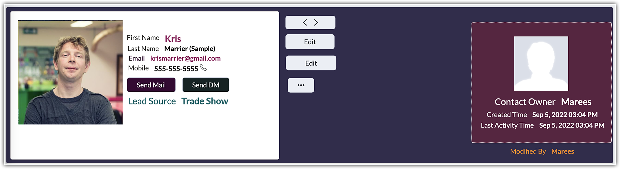
- Images: The
Image element can be used to add image component in detail page. For
example, you can add an image component and set it as a profile picture
for the particular record.
- You can select and drag the image element into the canvas and align it with the existing elements.
- Click on the image element and you will the option to upload image.
You can browse and upload images from your device or choose from the previously uploaded images saved in My Images tab, or add image from URL. - After adding the image, you can resize it, adjust other styles like border, shadow, radius, padding, etc.
- Icons:
Use an icon to represent a field instead of conventional text label.
For example in the image below the product name and price are displayed
using icons instead of text.
- Scroll on the icon bar to move up and down and choose from the wide range of icons.
- Click on the icon to clone, delete or change.
- Drag the borders to increase or decrease the size.
Fixed and Fluid Component
Every
element (section, tab, text, table) has an option to set it either as a
fixed or a fluid component. By selecting fixed component you can
restrict the size of an element from changing according to a user's
screen. On the other hand, selecting fluid component will allow the
element to resize itself according to users' screen size.
For
example, if you think the background image inserted for a section may
spill outside a certain screen size then it is best to set it as a fluid
component so that it adjusts the size depending on users screen.
Applying Style to the Elements
Style
such as background color, padding, field label alignment, border,
margin, etc. can be applied to all the elements. You can also customize
the page background by using the style options. Some options are
specific to an element. These style options can be added to the presets
and reapplied to new elements in the future.
Watch the videos in the playlist below to quickly learn how to apply styles.
Style options for a page
The page customization comprises of:
- Background
- Padding
- Height
- Width
- Fit to screen
Background
- Select a background color from the palette or color picker. You can also mention the HEX code of the color.
- Select
the Image checkbox and click Upload Image. In the pop-up you can either
upload image from the device, choose from previously uploaded images,
or use URL to add image.
- Image Size - The size can be defined using three options.
- Contain - This option will adjust the size of an image to fit into a page, while keeping the aspect-ratio intact.
- Original - This image will be retained in its original size.
- Cover - This option will stretch the image to fill the length and width of the page regardless of the aspect-ratio.
- Image Repeat -
If the size of the background image is small such that it doesn't cover
the entire page, you can use the image repeat option. This will let you
repeat the image multiple times and fill the background completely.
Following repeat types can be selected:
- X - The image will repeat along the X axis.
- Y - The image will repeat along the Y axis.
- Both - The image will repeat along both the X and Y axis of the page.
- No Repeat - This prevents the image from being repeated.
- Select the Gradient
checkbox to create a smooth transition between multiple colors in the
background. If you choose multiple colors in a straight line, then the
position can be adjusted to offer a perfect blend of all the colors.
Padding
Padding
determines the space around the content inside a margin/border. To
modify padding, select the element and click the Padding checkbox.
- Increase Padding: The padding can be increased by dragging the slider to the right. You can also specify the padding in Pixels.
- Same padding for all sides:
The Padding same for all sides checkbox applies the padding that you
have configured on all four sides of the element. You can unselect tis
checkbox and define different padding for all four sides of the element.
Height and Width
Adjust
the height and width of the page by entering the values in pixels or
you can check the automatic option so that the screen adjusts
accordingly.
Fit to Screen
The page will expand and adjust itself according to the length and width of the users screen.
Style options for the sections
The section can be customized using:
- Background - The options are same as that available for the page.
- Border
- Shadow
- Radius
- Padding - The options are same as that available for the page.
- Height and width - The options are same as that available for the page.
- Depth
Border
Click the border checkbox and do the following:
- Adjust thickness: Drag the slider to increase the size of the border. You can also enter the border value in pixels.
- Style: Select a border style from the drop-down list.
- Color: Choose a color for the border from the color palette or enter HEX code for a color.
- Same border for all sides:
Check this option to apply the border settings to all the four sides of
the section. You can clear this checkbox and define different width,
style, and color for each side.
Shadow
Click the shadow checkbox and do the following:
- X -
Based on the value, the shadow will move horizontally (left or right). A
positive 'X' value will place the shadow on the right side of the
element. A negative value will push the shadow to the left.
- Y -
Based on the value, the shadow will move vertically (top or bottom). A
positive 'Y' value will place the shadow at the top and a negative 'Y'
value will push it to the bottom.
- Blur -
Defines the sharpness of the shadow. If the blur is 0, the shadow will
be sharp. Higher the value lesser will be the sharpness.
- Spread - Adjust the size of the shadow, positive spread value will increase the shadow and negative spread value will decrease it.
- Color - The border color can be chosen from the color picker.
Radius
Give rounded corners by defining the radius. Click the Radius checkbox and do the following:
- Increase radius: Drag the slider to increase the radius or enter a value in the box.
- Same radius for all sides:
Check the option to keep the radius size same for all four sides. You
can uncheck the option and define different radius sizes for each side.
Margin
Define
the position of the element in the details page. To add a margin
padding, select the element and click the Padding checkbox.
- Increase Margin: The margin can be increased by dragging the slider to the right. You can also specify the margin in Pixels.
- Same margin for all sides:
The Margin same for all sides checkbox applies the margin that you have
configured on all four sides of the element. You can unselect tis
checkbox and define different margin for all four sides of the element.
Style options for a tab
The tab can be customized using: (background, border, radius, padding, and margin are same as mentioned above).
- States
- Background
- Border
- Radius
- Padding
- Margin
- Icons
States
Customize
the tab to make it distinct at each state. For example, the background
color, margins or background image can be different when the tab is in
Active state, similarly when the tab is in Hover state the borders can
be set in blue color for clear distinction. What does each state mean:
- Active - When the tab is selected.
- Hover - When you hover over the tab name.
- Normal - When the tab is not active or hovered.
You
can also change the font, font size, color, case, strikethrough or set
the text alignment to left, centre or right for each of the above
states.
Name the tab by clicking on the tab and entering the tab name in the text bar under Active state.

Note
- Related lists added to the tab element can't be renamed.
- Click the + icon to add more tabs.
- Right
click inside the tab to insert more fields, fixed or fluid component or
delete the tab. You can also click the close icon to delete a tab.
- Hover over the three bars next to the tab name (
), when you see the double-sided arrow drag and drop the tab to the desired position.
Icons
The tabs can be represented using the icons. Right click on the tab name and click Show Icon to view and select the icons.
Once the icon is added, right click to Hide or change the icon and Hide the tab name.
Style options for a table, text, icon, and line
For table, text, icon and line the common styling options are
- Border
- Shadow
- Radius
- Padding
- Depth
In addition to this you can perform the following customizations in text, icon, and line.
Text: You can also change the font, font size, color, case, strikethrough or set the text alignment to left, centre or right.
Icon: The icon color, background color, background image, border, shadow, radius, padding, and depth can be customized.
Line: You can set the line to horizontal or vertical, adjust thickness, style, and color.
Style options for the Field label
The field label can be customized using style options as well as by choosing options from within the tab.
- Change the font, font size, color, case, strikethrough or set the text alignment to left, centre or right.
- Align the label to left, top, right, bottom.
- Change the background color, radius, padding, and margin.
- Right
click on the label to change the field, hide label, move the label to
the left or top, fixed or fluid component, copy the style and delete the
field.
Adding style options into presets
Style options can be added to presets by selecting the element in the canvas and right clicking on it. 
This lets you style the elements uniformly throughout the canvas, without having to recreate and edit them every single time.
The following are the style options that can be added to presets:
- Text, Label, and Value
- Field
- Section and Page
- Tab
- Related Lists
- Table
- Buttons

Notes:
- You can add up to 25 styles to the presets.
Applying style options from presets
Once
you have added the style into presets, you can select the element in
the canvas, access the style under the custom tab, and select the
desired style to apply.
Alternatively, you can also use the pre-existing style options from the gallery.
Managing Reusable Components
Components
like styles, elements, and data form the structure of a template. Once
you save the desired components into the reusable components, you can
start using them to create new templates by a simple drag and drop
action. This saves you the time from recreating the component all over
again.
Before adding the component into the template, you can also preview it by hovering over the component.
For
example, in the image below, a section is saved to the reusable
components. When the admin wants to add a snippet like below, instead of
creating one every time, the section can be saved to the reusable
components and reused in different templates.
Also, you can choose the pre-existing components from the gallery and add them to the canvas, at ease.
Notes:
- You can save up to 25 preferred components into the reusable components.
- A
component can be reused on templates created for various CRM modules.
The fields created for one module will be automatically mapped and
displayed with the fields of the other.
- If
the fields could not be matched, a similar field type available in the
module chosen will be displayed and if the field type is not available
in the destination module, then it will be denoted as N/A. In either
case, you can change the field type by right clicking on the component.
Exporting and importing Canvas templates
Exporting Canvas templates
Once
you've created a Canvas template, you can share it with users in your
organization or with users in another CRM organization using a unique
key. This key is an alphanumeric code that can transmit the UI of your
template.
Note:
- You can export a template to any organization using a Zoho CRM edition that supports Canvas.
- When
sharing a template, only UI features like elements, components, and
styles are transmitted. Values, images assigned to the template, and
rules are not transmitted.
- You can
use template keys across modules. In other words, if you've exported a
code from a template created for leads, you can use the same code to
import the template into a different module. The UI will be transmitted
and the fields in the importing module will be automatically adopted by
Canvas.
- You
can have a maximum of 10 export keys generated at a time, irrespective
of the module for which the template was created. If you've reached that
limit, you can delete any existing template code from the export
history and avail new export key.
- Each unique export key is valid for only seven days from the date of creation.
- You
can keep track of your active keys in the export history using the
Manage keys option. It lists all the exported codes in the last seven days.
- You can verify your template by previewing it.
- You can copy the code from the history.
- You can also delete
the code from the history. It's important to note that once an active
code is deleted from the history, a new code is generated for that
template and the old code will no longer be functional.
To export a canvas template
- On the Canvas home page, hover over the desired template you want to export, and click on the ellipsis icon (...).
- Select Export canvas.
- The Canvas template export page will you notify you about the number of times you can export templates from your organization. Click on the Export button.
- The
following page will display a unique alphanumeric key. Click Copy and
then click Done. The key can now be shared with the recipient
personally.
To preview, copy, or delete the export keys from history, click on the Manage keys button and hover over the desired exported key.
Importing Canvas templates
Aside
from creating a new canvas template from scratch or cloning an existing
template, you can also import a canvas template which a user in your
organization or a different CRM organization has shared with you. Once
the unique key is applied, you can edit the template and assign it to
users in your organization.
Notes:
- You can import a template into any module or layout.
- Importing a template counts as creating a new template and Zoho CRM follows the same template limits. Click here to learn about the limits for each module.
- If
the export code is deleted or expires before you import, the code will
no longer be valid, and you will have to obtain an updated code.
To import a canvas template
- On the Canvas home page, click on the dropdown next to the Create Record Detail Page button.
- On the following Import a custom record page, select a module and a layout, paste the template key, and click Import.
Importing and exporting templates to and from Canvas: Alternative method
In
addition to the above methods of exporting and importing a canvas
template, you can export or import a template from the Canvas editor via
the following steps:
- In the Canvas home page, create a new record detail page.
- Click on the ellipsis icon (...) in the left panel.
- Select Import Canvas template.
- Select Export template.
Note:
- When
you import a new template with the same name as an existing template,
the existing template's design elements will be overwritten by the new
template.
- You can also transmit all the components and presets that you have saved to reuse.
- You can only export/import templates as a whole.
Setting canvas detail page as default
You
can set permission under Canvas Assignment for profiles who should view
the canvas detail page as default. Users from the selected profiles
will always view the canvas detail page only.
To make canvas detail page default
- Go to Setup > Customization > Canvas .
- Click the Canvas tab > Canvas Assignment.
- In the Canvas Assignment page, select the module and layout from the drop-down list.
- Select the Canvas against the respective profile.
- Click Save .
Note
Under Canvas Assignment in the list view hover over a canvas and click the More icon to edit, clone, rename, preview or delete a canvas design.
Related Articles
Allow Developer access to Adviser CRM
DEVELOPER ACCESS From time to time we may need Developer Access to your account to help with setup, training or any issues you may encounter. Please follow these steps to enable developer access. After you have logged into your CRM the top right ...How to change your password
How to change your password The video below is in two parts as follows; How to change your user password, if you know your current password; How to change your user password, if you do not know your current password For Option 2 just fast forward to ...
Phone: +64 9 930 9390
Mobile: +64 27 577 7764 (Sean Davis)
Email: support@advisercrm.co.nz
Please do not send support requests by text